Client
Ripplevia
Sector
Professional training
Scope
Discovery, naming, identity
Year
2026
The Context
The founder came to me with a proven programme and no brand. She had:
- ✓ A certified three-day course teaching customer-facing professionals the root causes of anxiety
- ✓ Years of talks and workshops with consistently strong feedback
- ✓ A clear first market: salons, barbers and other client-facing businesses
- ✓ Ambitions to expand into schools, corporates and further programmes
What it didn't have was a name, an identity or a way of presenting itself that could support that growth. The brand also had to stand apart from the founder personally, so the business could scale and, one day, be sold.
The job was not to make a logo for a course. It was to build a master brand that a growing training business could live inside for years.
The Core Challenge
Escaping the Wellness Look
Mental health branding tends to default to soft gradients, lotus flowers and “just breathe” language. The founder was emphatic: her approach is logical and solution-based, and the brand had to read that way.
A Name That Wouldn't Box the Business In
Early in naming, the brief shifted. Anxiety training would be the first programme, not the only one. Any name built around “anxiety” or one specific method would have to be replaced as soon as the second course launched.
Readability as a Requirement
Feedback on the first invented names was blunt: some were hard to read, including for dyslexic readers in the target audience. Short, phonetic names that sound out easily became a hard rule, not a nice-to-have.
Ownable From Day One
A name is only useful if the business can actually own it. Strong candidates fell away because the company name, domains or social handles were already taken, or a similar business was operating in the same space.
Strategic Positioning
The positioning shift:
From “an anxiety course” to “a training brand that helps people understand the patterns behind how they think and act, and change what follows.”
The idea at the heart of it came from the founder's own story: thinking habits ripple through families and workplaces. Break the pattern at the source and the change spreads outwards. That ripple became the brand's organising idea.
Brand Personality
- Knowledgeable, trustworthy and down-to-earth
- Smart enough to be taken seriously, never stiff or corporate
- Calm and dependable rather than loud or premium
- Quietly playful: humour used to break patterns
Deliberately Not
- ✗ Mindfulness, “airy-fairy” or therapy-coded
- ✗ Bold, flashy or exclusive
- ✗ Quirky or nostalgic
- ✗ Tied to a single condition or a single person
Every naming and design decision was tested against these two lists.
Finding the Name
1.Discovery Brief
A structured discovery session captured the business, the origin story, the ideal customer, who it isn't for, and the brand's personality. The brief was signed off before a single name was written.
2.Two Shortlists, Checked for Availability
I developed descriptive and invented directions, then screened every candidate against Companies House, the .com and .co.uk domains, and Instagram, TikTok and Facebook handles before presenting it.
3.Reset Around the Real Brief
Once it was clear the business would run several programmes, I removed every anxiety-led name and rebuilt the shortlist around an umbrella brand, with individual courses sitting underneath it.
4.Iterating on What Resonated
The founder and her business partner kept coming back to two ideas: “ripple” and “pattern”. I explored combinations of both and ruled out the ones that clashed with active companies or similar coaching brands.
5.Ripplevia
The chosen name joins ripple, the founder's mission, with via, a route or way through. It describes a path along which change spreads, works for any future programme and stays easy to say. It is paired with the line “Understand the pattern. Change what follows.”
The Identity

The Logo: “The Signal”
Four logo directions were presented in black and white first, so the decision rested on the idea and the shape rather than colour.
The chosen mark uses three bars that build from light to dark before resolving into the R. It reads as progression: a pattern being noticed, interrupted and turned into something stronger.
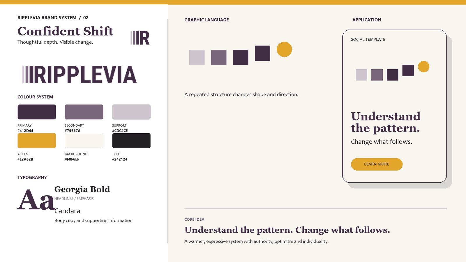
Colour: Confident Shift
Primary
#412D44
Secondary
#79667A
Support
#CDC4CE
Accent
#E2A62B
Background
#F8F6EF
Text
#242124
Deep plum feels thoughtful and established. Marigold is used sparingly as the “point of change”, the one moment of brightness in every layout.
Typography & Graphic Language
Understand the pattern.
Change what follows.
Georgia Bold for headlines gives authority without stiffness; Candara keeps body copy warm and readable.
The graphic system follows one rule: a repeated structure changes shape and direction, and gold marks the outcome. Bars, rings and loops all keep rounded ends and that progression.
Three Directions, One Logo
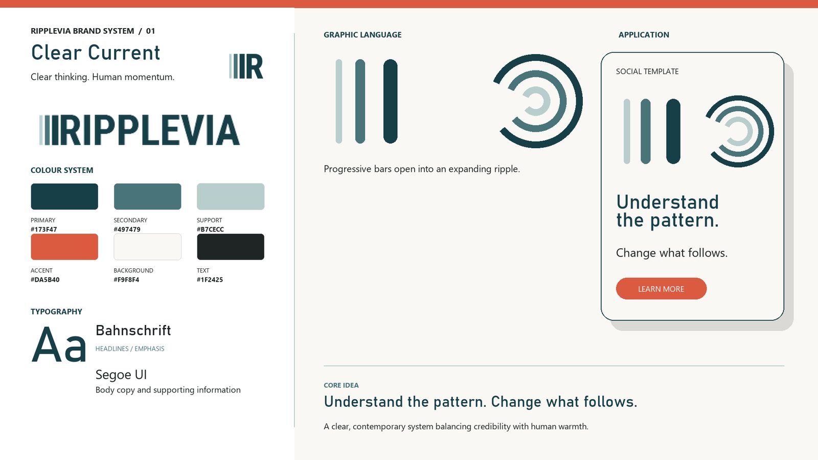
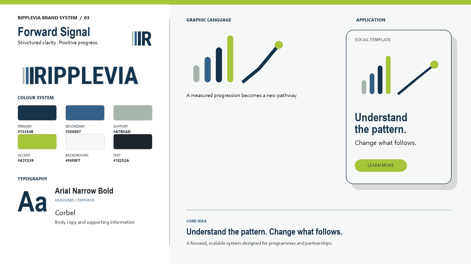
With the logo locked, I built three complete brand-system boards around it, each with its own palette, typography pairing, graphic pattern and application. The founder chose Confident Shift: the warmest and most individual of the three, while still feeling grown-up and practical.
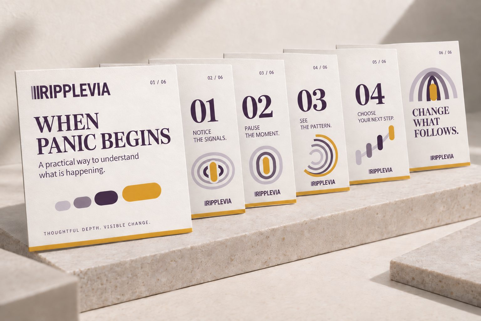
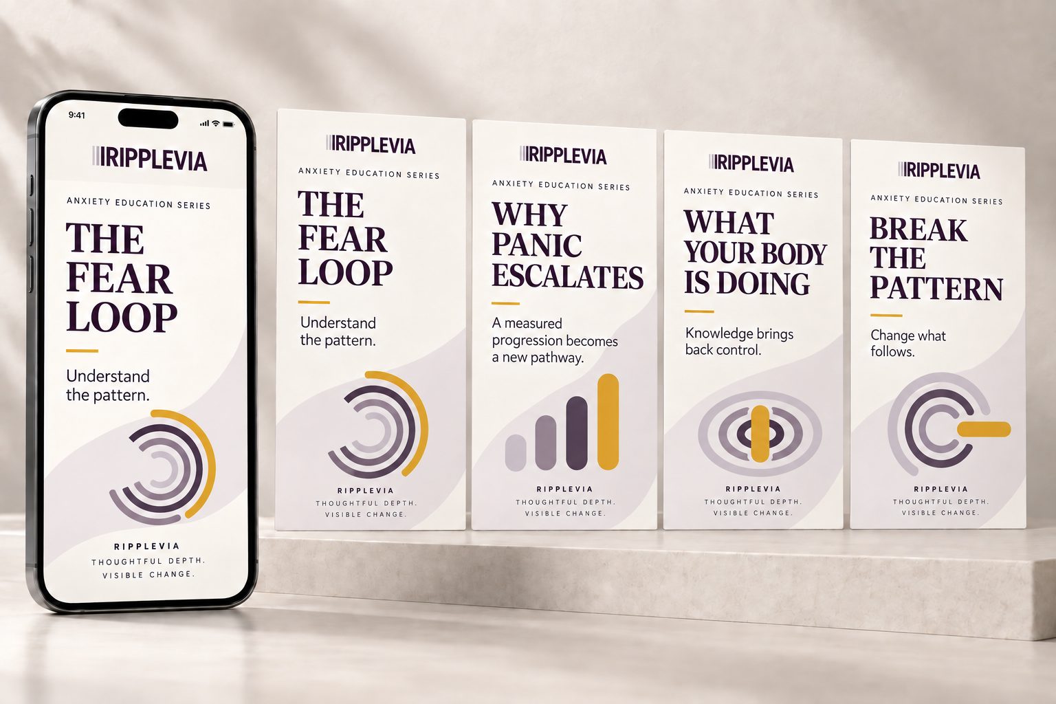
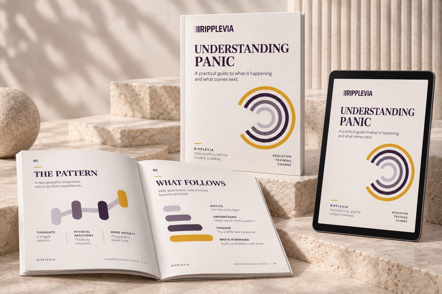
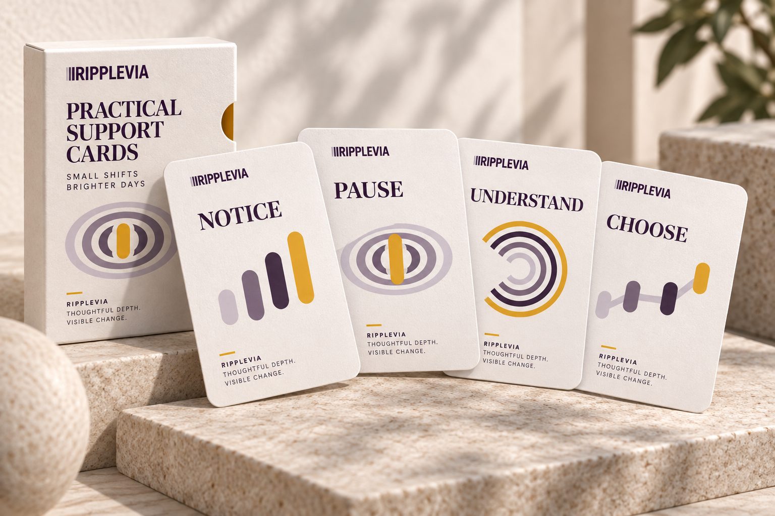
The Brand in Use
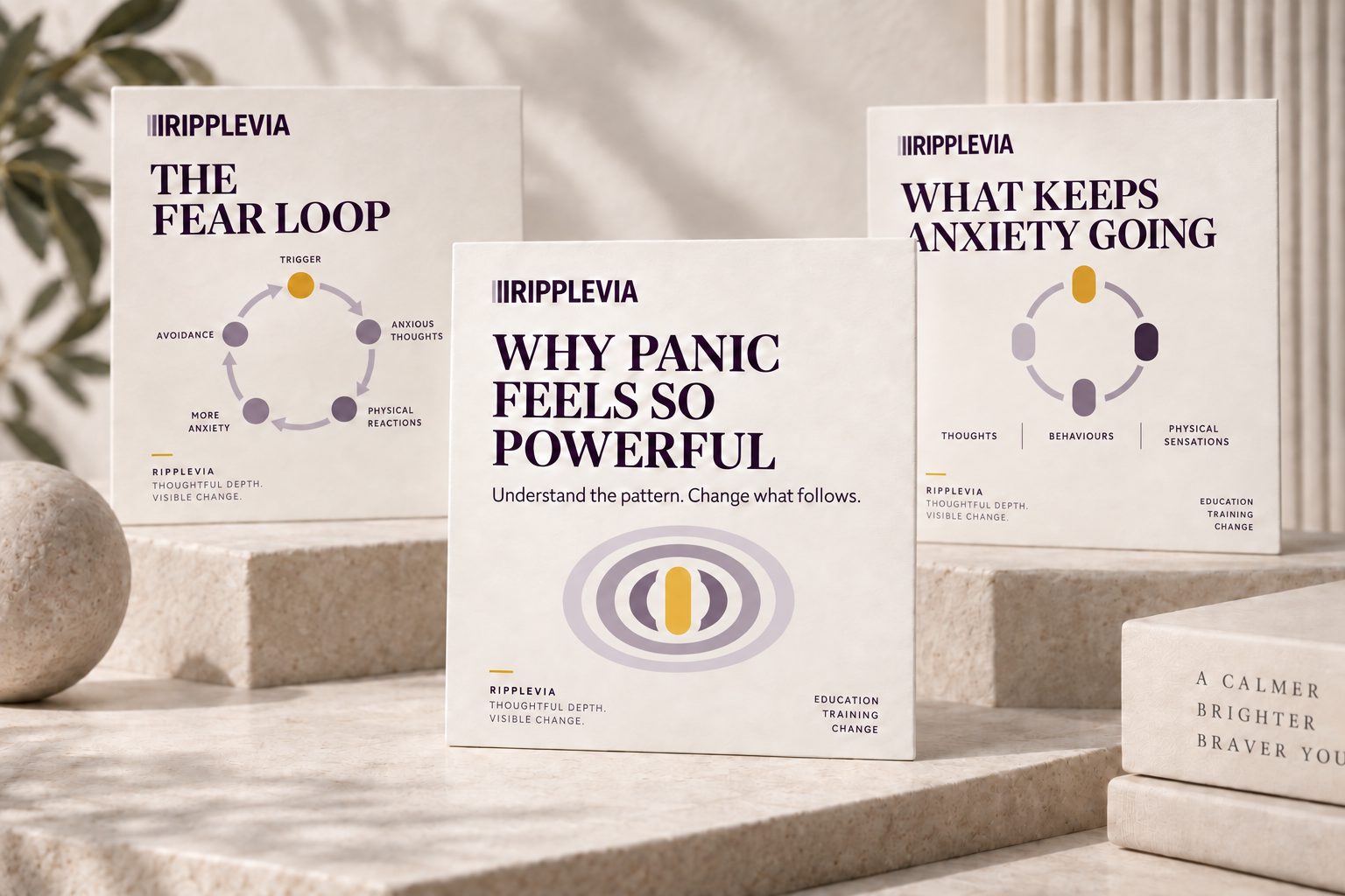
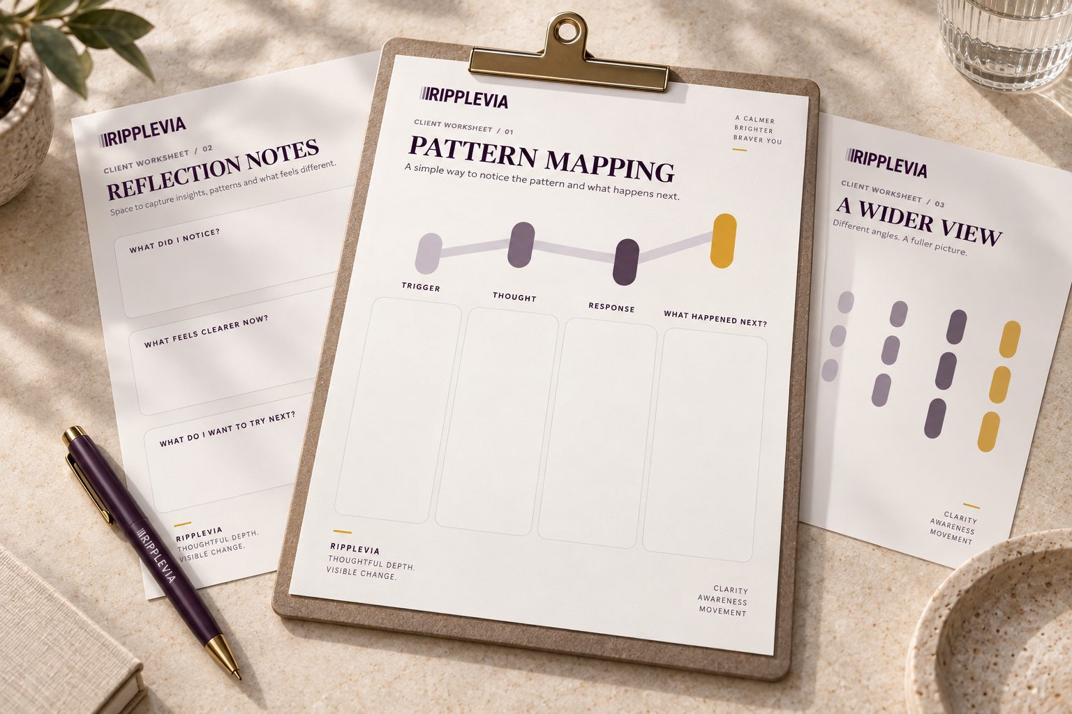
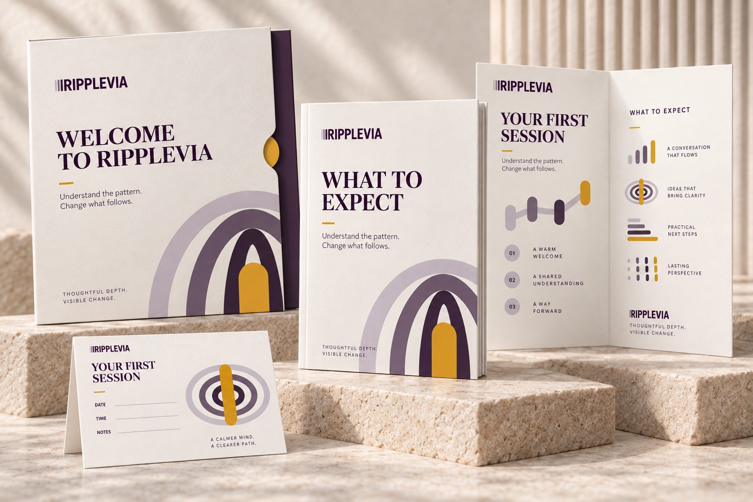
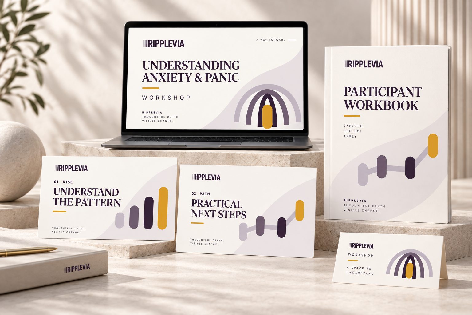
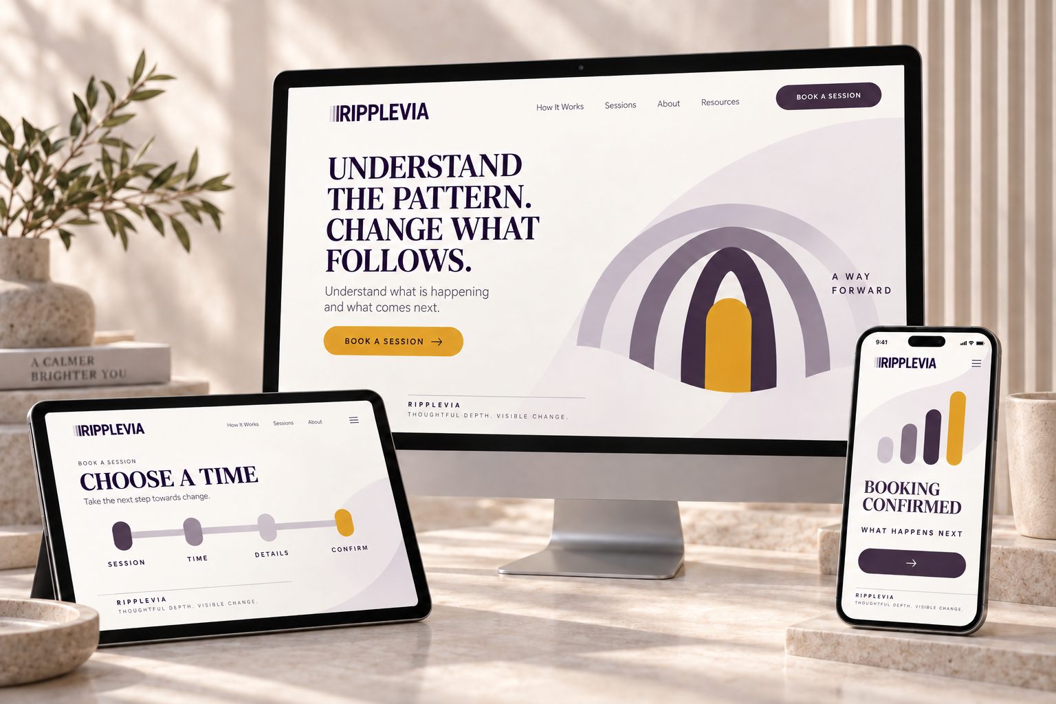
To prove the system works beyond a logo sheet, I applied it across the touchpoints the business will actually need, from social education content to course materials and the booking journey.
Key Strategic Details
A Master Brand, Not a Course Name
Ripplevia sits above the programmes. Anxiety is the first; confidence, resilience and others can launch under the same name without a rebrand.
Shape Before Colour
Presenting logos in black and white first kept the conversation on meaning and form. Colour was only explored once the mark itself was agreed.
Credible, Not “Wellness”
Editorial serif headlines, diagrams instead of stock calm imagery, and one disciplined accent colour make the brand feel like expert training rather than self-care content.
Client Feedback
“I like working with you. You're fast, professional and accommodating.
You're clear, you do what you say you will, and when you say you'll do it. I'm happy with how many files you sent over and I love the page of info.
I love how you get me and the business.”

Tammy Rolfe
Owner, Ripplevia
What This Project Demonstrates
Ripplevia didn't need a pretty logo. It needed a name and an identity that matched how the founder actually works, could be owned outright, and wouldn't have to be thrown away as the business grew.
The result is a brand built on one idea, “understand the pattern, change what follows”, carried consistently through the name, the logo, the colour system and every touchpoint.
Scope note: This project covers discovery, naming, logo design and the brand system. Application images are design visualisations of the identity in use. Availability checks were preliminary and do not replace formal trademark clearance. No commercial results are claimed.
Why This Matters for New Businesses
The name you launch with is hard to change later. Choosing one around your first product, or one you can't secure online, often means a costly rebrand just as momentum builds.
Starting Something New?
If you're launching a business or a new offer and need a name and identity that will grow with you, let's talk about where to start.
Book a Consultation